By Brian Bloom | 27 November 2007
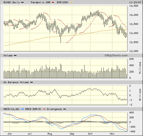
The Dow Jones Industrial Index is now badly oversold from a technical perspective, and it looks more likely that the markets will bounce up than "collapse". Having said this, the most important chart in the array of charts seems to be the Dow Jones Industrial Index below.
Click Here, or on the image, to see a larger, undistorted image.
(Charts Courtesy Bigcharts.com)
If we focus on the On Balance Volume chart we see that, since October, there have been a series of falling bottoms— and about a week ago, the OBV fell to a new low. This constituted a "sell" signal. Since then it looks like it wants to rise because the there has been a series of three rising lows in the last week.
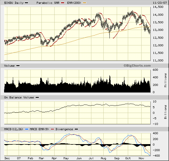
To give you some context, the chart below is the same chart, but it shows a 12 month period.
Click Here, or on the image, to see a larger, undistorted image.
Since around May this year, the OBV has been hovering around the 5-7.5 billion share mark, and the OBV is now closer to the 5 billion mark.
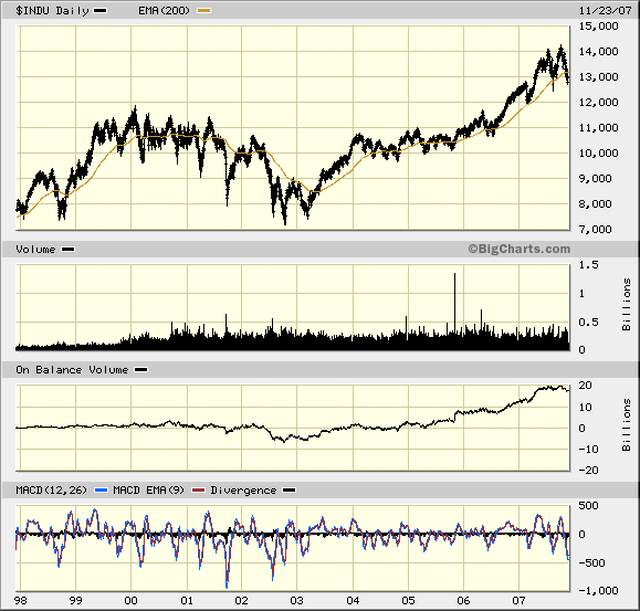
If you now look at the next chart— which is the same chart dating back to 1998, you see that the OBV started rising strongly in mid 2003— following what is known as a "non confirmation" by the MACD. In late 2001, the MACD fell to a low when price fell to a low, but in 2002, when the price fell to a lower low, the MACD low showed rising lows
Click Here, or on the image, to see a larger, undistorted image.
Now let's focus on the MACDs in the three charts. Note how the MACD fell to a lower low in November than in August (in the first chart) Note the series of three descending lows in the MACD in the second chart Note, in the last chart, that the MACD at -500 is far higher than the 2001 low of -1,000. There is a formation on the 10 year chart above— known as a "megaphone" formation— which has been slowly emerging in 2007.
Since about June, there have been three successive rising tops and also three successive falling bottoms in the price chart. This is a sign of confusion. The bulls have been increasingly bullish and the bears have been increasingly bearish.
That's why the On Balance Volume Chart is so important. It tells you who is winning the war.
The first chart above shows that, during the period when the megaphone was being formed, on balance, sellers prevailed. There was less volume changing hands when the three new highs manifested that there was when the three new lows manifested. Net, Net, selling pressure has prevailed. Having said this, selling pressure has been subtle. It does not reflect urgency so much as opportunism.
My interpretation of all of the above is that, with the market very badly oversold, it should bounce upwards in the very short term— but this will be a sucker rally. I don't think the market will rise to new highs [[probably just another chance for the "smart money" to leave— before next summer. But, it would seem, that the "positive" season has begun (or is about to).: normxxx]].
So far, the above does not show signs of any coming "Panic". More likely we will see a series of hopeful rallies followed by a series of agonising falls— with a bias to the downside. The 11,000 level seems like it will offer significant technical support, and the 13,000 level now represents resistance.
The days of easy money "day trading" profits are behind us.
Now let's focus on gold. Does this represent a "safe haven"?
The biggest single issue relating to gold is that it has highly emotive connotations. This is not an accident of history. There are significant practical reasons for this, which have nothing to do with "money". These reasons are too involved to be explained here, and so we need to cut through all the "theory" and look at the charts.
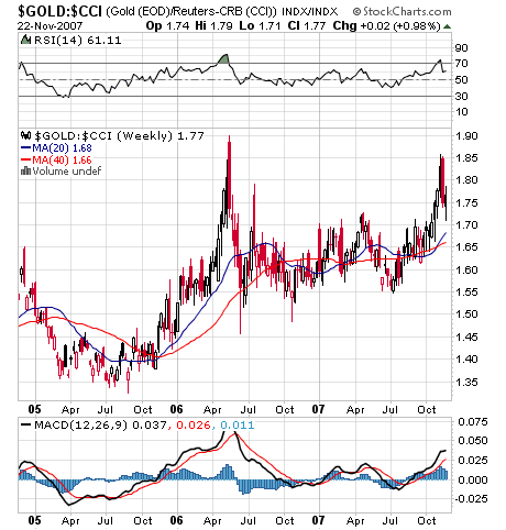
The first chart below shows gold relative to the $CCI commodity index on a weekly basis: (Courtesy stockcharts.com)
Click Here, or on the image, to see a larger, undistorted image.
This is not an easy chart to interpret. From a bullish perspective, one could argue that— since April— there has been the emergence of a "saucer" formation. If it breaks through the 1.9 level it might scream upwards relative to commodities.
From a bearish perspective, the MACD looks overbought as does the RSI.
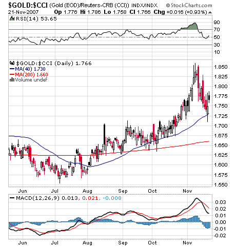
Now, if we look at the daily charts, this is even more confusing:
Click Here, or on the image, to see a larger, undistorted image.
Here the MACD looks like it is turning up, as is the RSI. Also, the price chart peaked and has been "neatly" consolidating as it pulled back to the 40 day Moving Average line— from which it is now bouncing up.
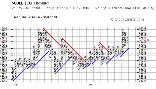
The saucer and the double top are clearly seen from the P&F chart below, and the three green Xs seem to show a healthy sign that the ratio will at very least consolidate around this level.
Click Here, or on the image, to see a larger, undistorted image.
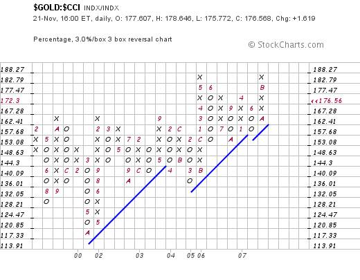
If we take a step back and look at the P&F chart, sensitised for a 3% X 3 box reversal, we see that a break to new highs will likely be very bullish. We could see the ratio rising to around 202
Click Here, or on the image, to see a larger, undistorted image.
The question is whether this will arise from an "explosion" in the gold price, or a fall in the prices of commodities in general.
The chart below is a 2% X 3 box reversal chart of the $CCI commodities index
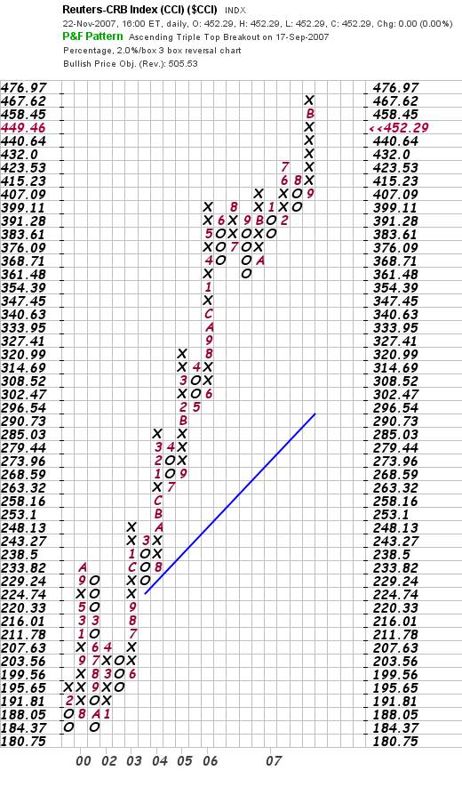
Click Here, or on the image, to see a larger, undistorted image.
This is hardly a bearish chart at present, but it might pull back to (say) the 430 level.
It would be easy to argue that "therefore, the market is expecting inflation, and all commodities should rise, with gold rising faster than everything else."
This argument is, in my view, too easy. The reason is that if the market was expecting inflation, long term interest rates should be rising.
|
The following chart shows that, contrary to expectations, long dated yields are falling.
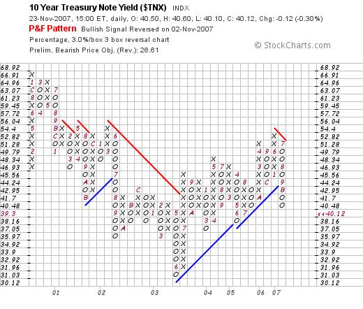
Click Here, or on the image, to see a larger, undistorted image.
So, with all the above in mind, where does the argument lead?
Overall Conclusion
It looks like "negativity" is the dominant emotion in the market, but right now this fear is manifesting more as caution than fear. Investors are moving to protect themselves.
Some are moving to put their money into hard assets, whilst others are moving to put theirs into government bonds. If hard assets become the "flavour of the month" then gold will likely outperform all the others.
Will there be a market crash? It is possible but, based on the current technical situation (which might change) I doubt it. Technically, the information above is biased slightly to the negative. It is not (yet) showing signs of panic. Fundamentally, if the market were to collapse at this point, it would be a collapse from which there would be no recovery.
Normxxx
______________
The contents of any third-party letters/reports above do not necessarily reflect the opinions or viewpoint of normxxx. They are provided for informational/educational purposes only.
The content of any message or post by normxxx anywhere on this site is not to be construed as constituting market or investment advice. Such is intended for educational purposes only. Individuals should always consult with their own advisors for specific investment advice.
No comments:
Post a Comment